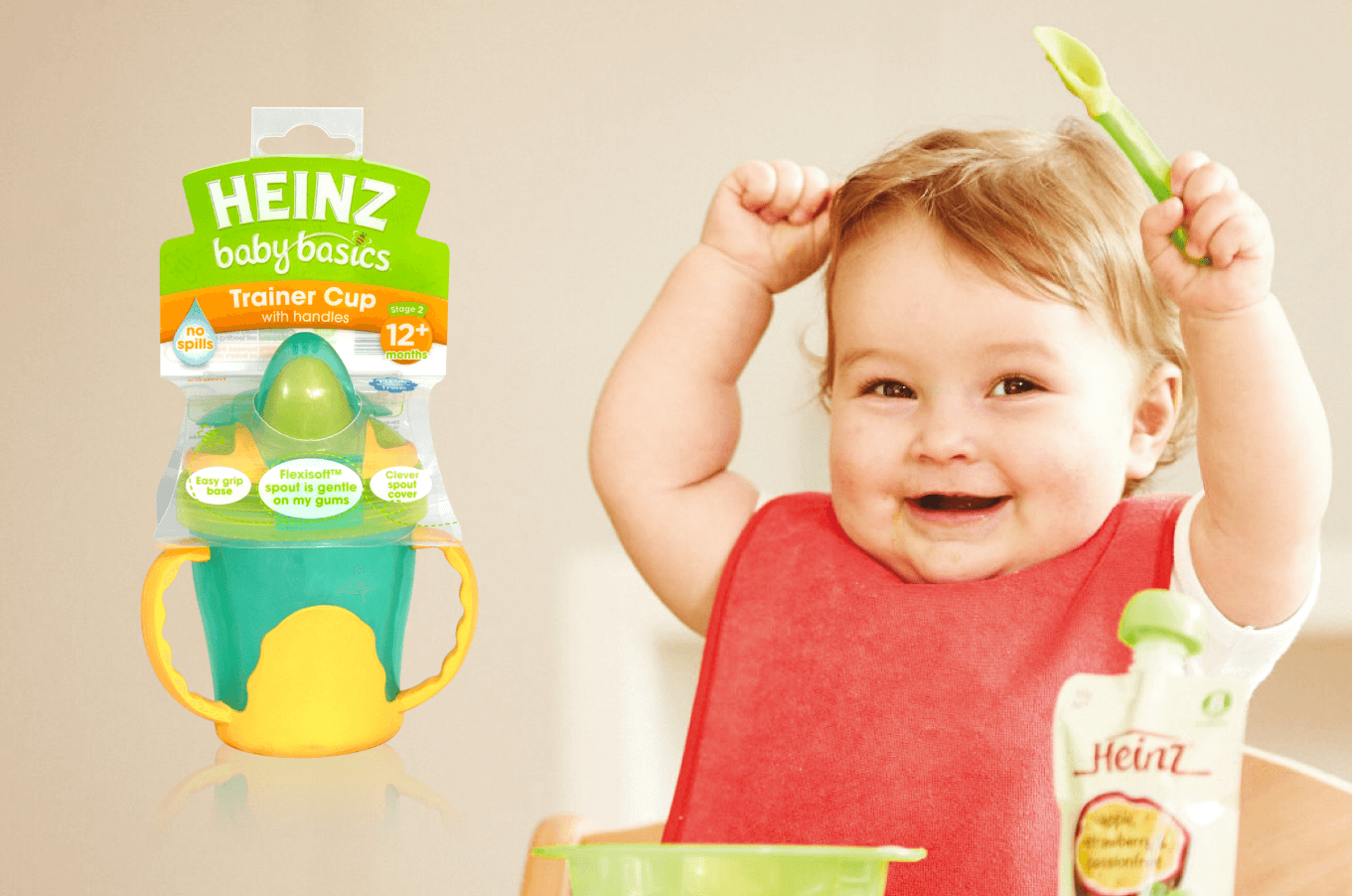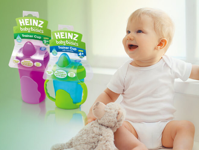

Heinz is a beloved children’s brand, and their Baby Basics training cup was a great product. But it was selling below expectations. How could we turn things around and do justice to the brand?
Marketing Collateral
Packaging & POS
Copywriting
The Baby Basics packaging did not showcase what was special about Heinz’s product. We identified three key areas that needed to be addressed:
1. the respected Heinz logo was under-leveraged in the current packaging
2. the packaging did not do a good job of communicating the product features
3. the current blister pack style of packaging didn’t allow consumers to touch the product and feel the quality of
the materials.
After an exploration into innovative materials and printing processes, we changed to an open style packaging that used spot colour screen printing on a polypropylene material. A unique dieline was needed for each product, providing security, resilience and ‘touchability’. We also created a new visual language that provided a solid platform in which to tell the story of the products’ virtues in a clear and compelling way.